
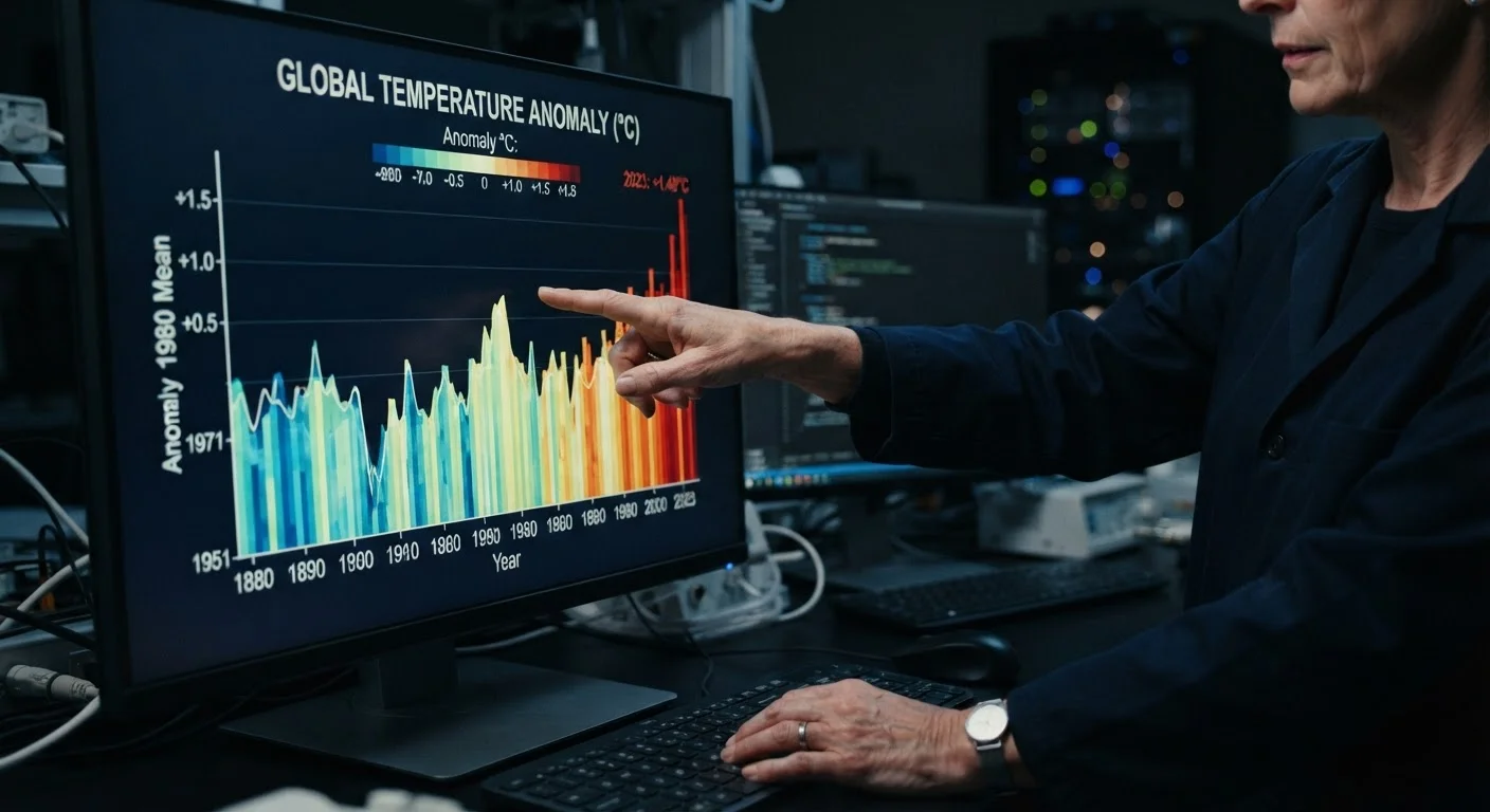
What an Anomaly Actually Measures
When a climate report states that last month was "1.3°C above average," that number is not an absolute temperature - it is an anomaly, a measured departure from a pre-defined baseline average. The distinction matters more than most readers realize.
Scientists prefer anomalies over absolute temperatures because they allow meaningful comparisons across geographically diverse locations. A station in Alaska and a station in Florida have very different average temperatures, but both can be assessed for how much they deviated from their own historical norm during the same period. Aggregating anomalies across thousands of stations gives a far more robust global picture than averaging raw temperatures.
The baseline is typically a 30-year mean, a standard set by the World Meteorological Organization. Common reference periods include 1951-1980 and 1981-2010.
Why Baselines Keep Changing
Major scientific bodies periodically update their reference baseline periods - for example, shifting from 1951-1980 to 1981-2010. This isn't data manipulation; it reflects standard statistical practice and ensures comparisons stay meaningful as instrument records lengthen. When comparing charts from different sources or eras, always confirm which baseline each is using before drawing conclusions.
How to Read Trend Lines Without Being Misled
A single data point - even a record-breaking one - cannot establish a trend. Climate trends emerge from data spanning decades. This is why scientists studying El Niño and La Niña cycles are careful to separate the temporary temperature influence of Pacific oscillations from the underlying warming trajectory.
When examining a trend line, look for:
- The time span shown: A 10-year window can look very different from a 140-year record.
- Statistical smoothing: Running averages (5-year, 10-year) reduce noise and reveal the underlying direction more clearly than annual data alone.
- Confidence intervals: Honest charts display uncertainty ranges. A trend line without error bands may be oversimplifying the data.
For readers curious about how scientists reconstruct temperature records before modern instruments, reading the paleoclimate record provides essential context.
Always identify the baseline period before interpreting any anomaly chart.
Climate anomalies are defined as deviations from a reference average - typically a 30-year mean. Without knowing that reference period, the numbers are essentially meaningless. A +1°C anomaly against a 1951-1980 baseline tells a different story than +1°C against a 1981-2010 baseline because the more recent window is itself warmer.
Examine the y-axis range and scale before accepting a visual impression of trend magnitude.
Compressing or expanding a chart's y-axis can make the same data appear dramatic or trivial. A temperature graph with a y-axis running from 13°C to 15°C will look like a steep climb; the identical data plotted from 0°C to 30°C appears nearly flat. Neither is dishonest, but neither tells the full story without context.
Distinguish between short-term variability and long-term trend lines.
Climate is defined by patterns over decades, not individual years. Natural variability from events like El Niño can temporarily push global temperatures up or down, making a single anomalous year a poor basis for trend conclusions. Understanding the difference between weather and climate is foundational here.
Cross-reference multiple independent datasets rather than relying on a single source.
Global temperature records are independently maintained by NASA, NOAA, Berkeley Earth, the UK Met Office, and Japan's JMA, among others. When these datasets - built from different methods and station networks - converge on the same trend, confidence in that trend increases substantially. Divergence between them is a signal to investigate further, not to dismiss the science.
Treat color choices in climate maps as interpretive tools, not neutral displays.
Color scales in temperature anomaly maps are design decisions. A diverging red-blue palette communicates warming and cooling intuitively, but the midpoint of that scale, and the range it spans, shapes perception. Some palettes make moderate anomalies appear extreme; others mute them. Checking the legend and understanding what the color gradient represents is essential.
Putting It Into Practice
Interpreting climate data well is a skill that develops with deliberate practice. The habits below can be applied immediately, regardless of your background in science.
For a deeper look at how these data-literacy skills apply to specific events, the science linking extreme weather to climate change shows how researchers use statistical attribution to connect individual events to long-term trends. And if you're still building your foundational understanding, reviewing common climate misconceptions can help identify where misreadings of data often take hold.