What Coverage Maps Actually Measure
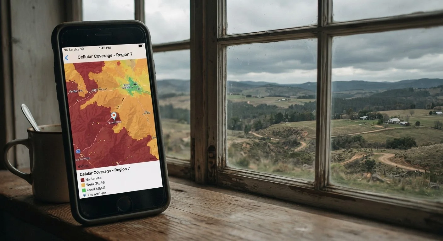
Carrier coverage maps are built from computer models, not field measurements. Engineers input data - tower locations, antenna power, terrain elevation - into software that calculates how far and how strongly a signal should travel under typical conditions. The result is a color-coded map that makes it easy to see where service is predicted to exist.
The key word is predicted. No carrier physically tests signal quality at every address or intersection on their map. The model makes educated assumptions, and in many locations those assumptions hold up reasonably well. But models have blind spots, and real-world conditions routinely fall outside what a model anticipates.
Before relying on a coverage map to choose a plan, it helps to understand what else to evaluate before signing up - coverage is only one piece of the puzzle.
The Physical Barriers Maps Can't Fully Capture
Radio signals don't travel through the world the same way light does through open air. They reflect, refract, and get absorbed by everything in their path. A thick concrete office building, a densely wooded hillside, or even a valley between two ridgelines can dramatically reduce the signal that a tower is projecting in your direction.
This is why you might get strong signal standing on the sidewalk but lose it the moment you step inside a store. Coverage maps are almost always calibrated for outdoor conditions. Indoor environments are significantly harder to model because building materials vary so widely.
Indoor vs. Outdoor Coverage: A Key Distinction
Most carrier coverage maps are built around outdoor signal predictions. When you're inside a building, signal strength can drop significantly depending on construction materials and how far you are from a window. If you spend most of your time indoors - at home or in an office - outdoor-calibrated maps may give you a rosier picture than you'll actually experience.
For a closer look at why terrain and distance create dead zones, see why phone signal drops in rural and suburban areas.
Congestion, Band Compatibility, and Your Specific Device
Even when a coverage map shows strong signal, that signal is shared. Every person connecting to the same cell tower is competing for the same pool of bandwidth. During peak hours - morning commutes, lunch breaks, crowded events - speeds can slow considerably even in areas with full coverage. A map shows signal availability, not network capacity or current load.
Your phone also plays a larger role than most people realize. Carriers operate across multiple frequency bands. Lower bands travel farther and penetrate buildings better; higher bands deliver faster speeds over shorter distances. Not every phone supports every band a carrier uses. A coverage map may reflect the full range of a carrier's network, but your device might only access part of it.
~30%
Signal loss entering typical buildings
Research on radio frequency propagation suggests indoor environments can reduce signal strength by roughly 20-30% or more depending on building materials and layout.
600 MHz-39 GHz
Range of frequency bands US carriers use
US carriers operate across a wide spectrum; lower bands cover more ground while higher millimeter-wave bands offer speed over very short distances.
These factors combine in ways that maps simply cannot represent. What looks like a fully covered area on a screen can translate to a frustrating experience for a specific person with a specific phone in a specific building. That gap between the map and reality is worth understanding before you commit to a plan - or before you assume your carrier is at fault for poor service. Our checklist for diagnosing weak signal can help you work through what's actually going on.
Better Ways to Gauge Real-World Coverage
Rather than relying solely on a carrier's map, there are more grounded ways to evaluate coverage for your specific situation. Crowd-sourced coverage apps collect signal data from real users in real locations, giving a much more practical picture of what to expect. Talking to neighbors, colleagues, or friends who already use the carrier you're considering - especially people who live or work in the same buildings you frequent - provides insight no model can replicate.
Many carriers offer short trial periods or satisfaction guarantees. Using a trial to test signal in the places that matter most to you - your home, workplace, and regular commute - is one of the most reliable methods available. Carriers are also required by the FCC to make certain coverage data publicly available, which can serve as a useful cross-reference.
Coverage maps are a reasonable starting point, but they work best when paired with on-the-ground verification. For a full picture of what carriers often leave unsaid about their networks and plans, see what mobile carriers don't always spell out when you sign up. And if you live or travel in rural areas, the factors behind coverage gaps run even deeper - the rural coverage gap involves economic and regulatory complexity that maps don't begin to show.